A responsive website for a delightful homemade cake ordering experience.
Overview
Discover | Problem
Hosting family or friends at home can be enjoyable, but preparing food for a large group of people can present challenges. It can take a lot of time and energy, leaving hosts feeling exhausted and unable to fully enjoy the event themselves.
My Role
Activities
User Research | Competitive Analysis | User Interviews | Affinity Mapping | User Personas | User Flows | Task Flows | Sketching | Wireframing | Prototyping | UI design | Usability Testing
“Often, I'm in a rush and buy a cake from the nearby bakery. But it takes time to drive there, and it can be a hassle.”
Duration
8 weeks | part-time
Tools
Figma | Maze | Whatsapp
Work process
Solo designer
Research
I began by looking at what our competitors are doing through research. I wanted to see how we could stand out. Then, I talked to both customers and the bakery owner. This bakery currently operates mainly through Instagram and WhatsApp.
Research | Competitive analysis
I checked out these bakeries because they're really popular in Chile, where Dita's Bakery is located. People who order homemade products, like homemakers, know them well.
Strengths
Differentiate categories
Gift option / customize message
Delivery information clear since the beginning
Immediate feedback
Aligned UI throughout all the website
Findings
Research | User Interview
Weaknesses
Information is not clear
Difficult to purchase
Pictures bad qualities
Missing delivery information
Missing alimentary restriction section or healthy
I've identified two main categories of findings: one related to the site experience and the other to product presentation. The site experience appears outdated and lacks smoothness, while the presentation of product information and images requires improvement.
I conducted in-person interviews with 5 adults ranging from 30 to 85 years old. All of them currently use alternative options when they run out of time to cook for friends and family. Among these interviewees, 4 are currently customers of Dita's Bakery, as well as other bakeries.
Affinnity mapping
Based on user insights, I categorized them into five groups: Pictures, Pricing, Delivery Information, Communication, and Products.
Findings
After analyzing the interview insights, I summarized them:
Pain points
Hard to connect with the bakery through Instagram.
Information is not clear.
Delivery information incomplete.
Product Sizing.
Payment step.
Alimentary restriction.
Gift option
Define
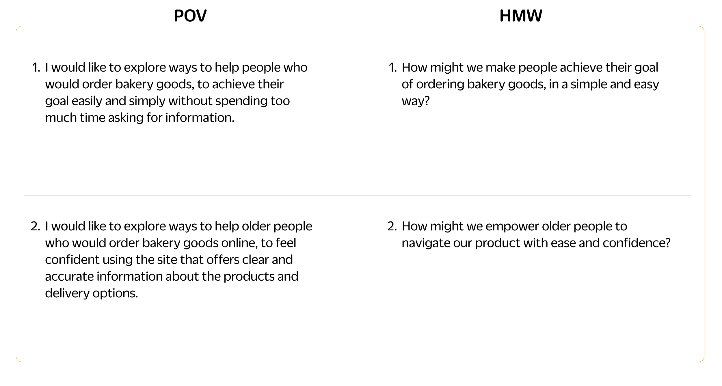
After gathering all the research about the experience of ordering a bakery product online, the data was synthesized and the problem defined, which helped me to develop the point of view (POV) and how might we (HMW) questions.
Define | User Persona
To better understand and empathize with users I developed one persona. She is 75 years old housewife who loves hosting family and friends.
Define | Story Board
Empathizing with my target, I sketched a storyboard to ensure I could address the feelings users go through during the process of ordering a homemade dessert.
Define | Feature Set
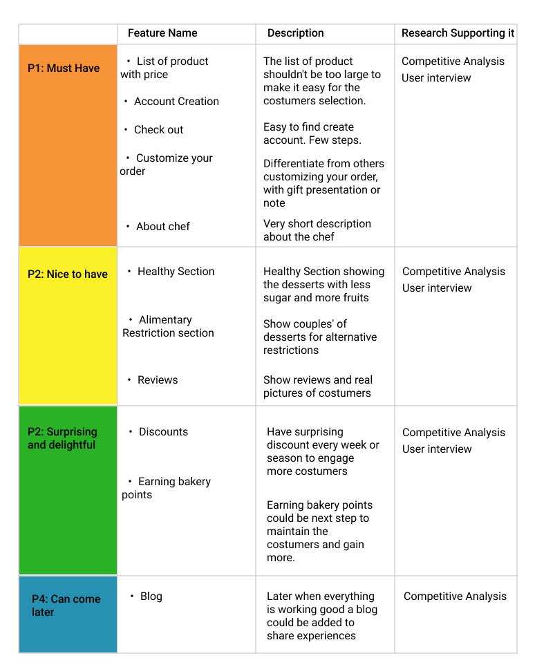
Based on recent research, I prioritized product features and organized them into four categories. I placed special emphasis on 'must-have' features due to time constraints.
Define | Site Map
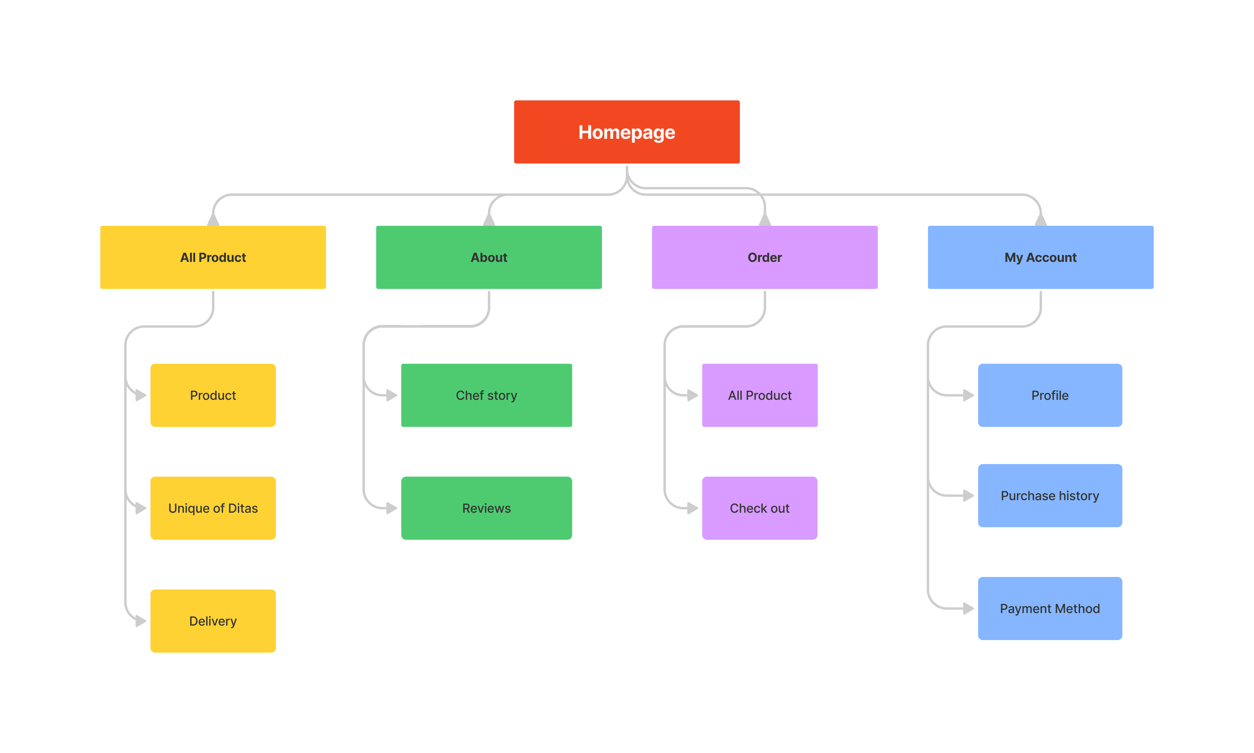
After defining the feature set and consolidating it through the card sort activity, I structured the sitemap into four categories using insights gathered from various research methods and tools:
All Product | About | Order | My Account
“When information is not clear I hate to be asking for details about size, price and delivery.”
“Cake presentation and packaging are crucial to me. I might eat something that doesn't look perfect, but when it comes to buying, especially for a gift, it has to look just right.”
” I'm always striving for healthier eating, which is why I opt for desserts with less sugar for myself and my family.”
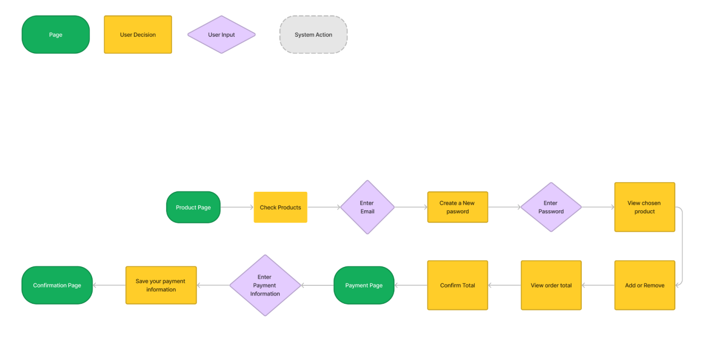
Research shows that users order bakery products online when the process is easy and clear. That’s why I developed Order a Product task flow.
I created a task flow for ordering a product because users often encounter challenges while trying to achieve this goal.
According to my research, users are more likely to buy a bakery product online if the user flow of ordering a product is easy and straightforward. Therefore, I focused developing the user flow of ordering a product.
Define | Developing Flows
Task Flows
Order a product
User Flows
Order a product
Design
In order to see how the design fits with users’ needs, I sketched some ideas and then made low-fidelity wireframes. This way, I could change them quickly, try new things, and then move to mid-fi wireframes.
Design | Wireframes
Low fidelity
An accustomed layout and clear CTAs were the keys to keeping it straightforward according to user needs.
Mid fidelity
Then I moved on to mid-fidelity to start giving more shape and see how it looks and works.
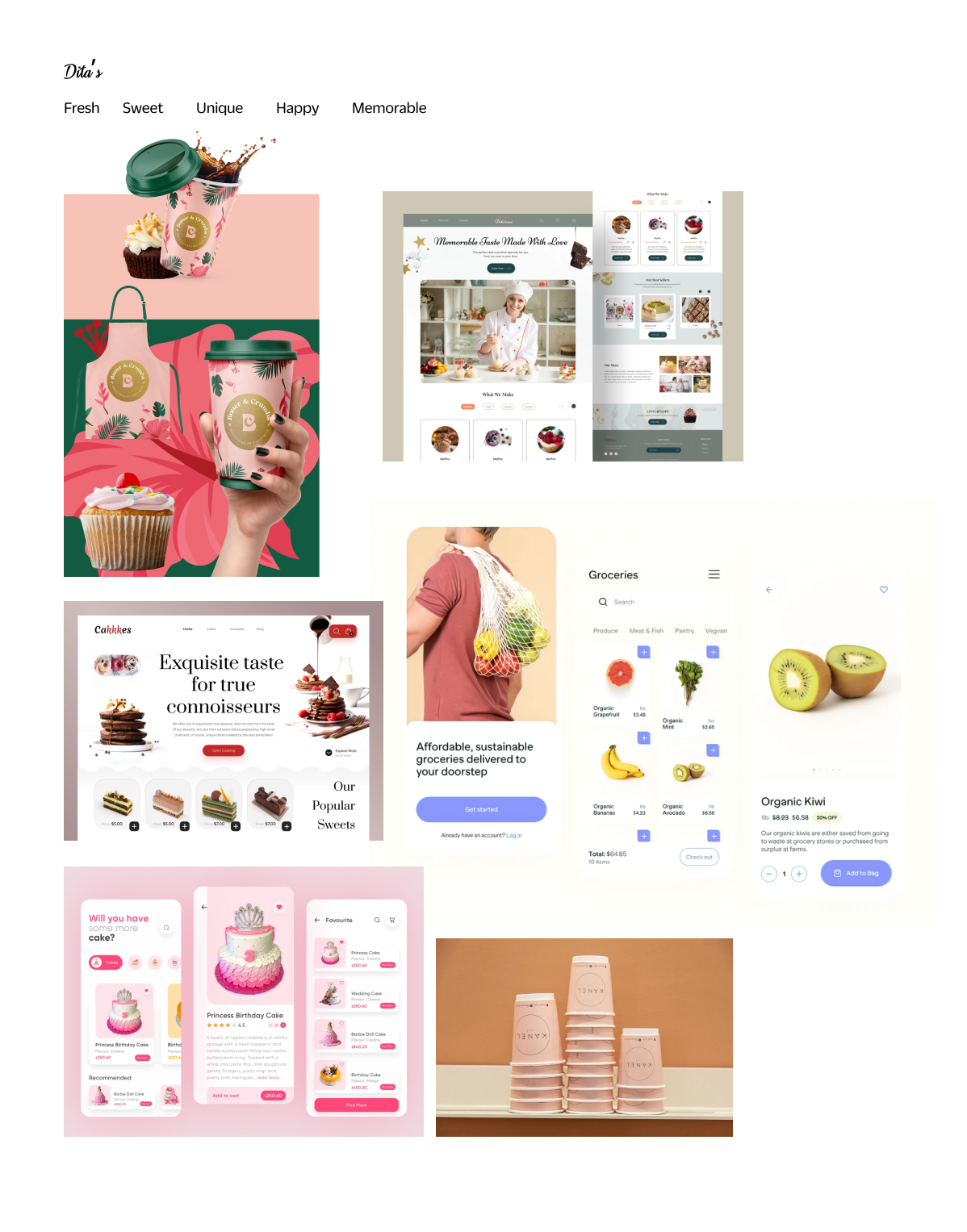
Design | Mood board
I searched for images and colors that matched its identity. I wanted to capture the freshness, sweetness, uniqueness, happiness and memorability of its products and services to express the design vision.
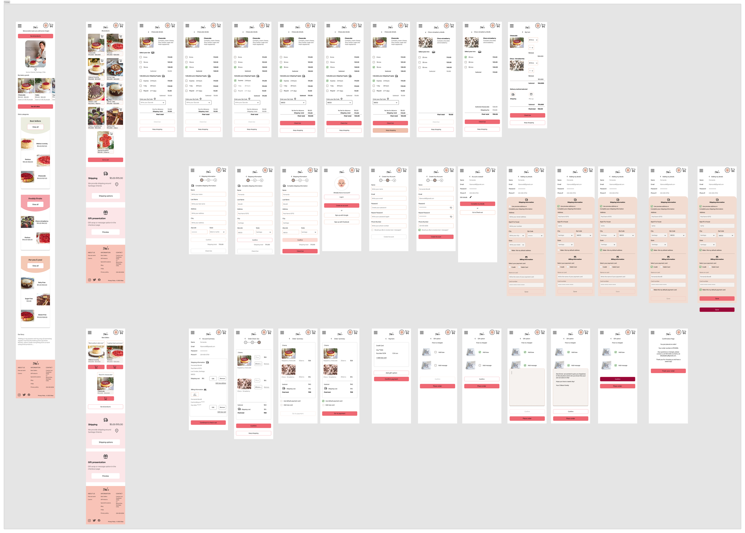
High Fidelity
Finally I polish the design to see how it looks and works with users.
Test
Five people around 30-85 were invited to try out the prototype and they gave us great feedback! They helped us make the site more user-friendly and easy to navigate.
Test | Usability testing
Findings
Simple design.
Color palette make sense with brand.
Easy to achieve the goal of order 2 products.
Icons are easy and comprehensive.
Easy to fill out forms and follow steps.
Prototype Iterations
1) Confusing CTAs on the homepage, poor readability of the hero picture, and inconsistency of icons across the site.
Before
I addressed this by keeping only the essential button based on user testing. I improved text contrast over the image and switched to simple icons aligned with the brand's products.
2) Lack of signal that product was added, topics are not right, missing questions about specific data of the product, and delivery information is confusing.
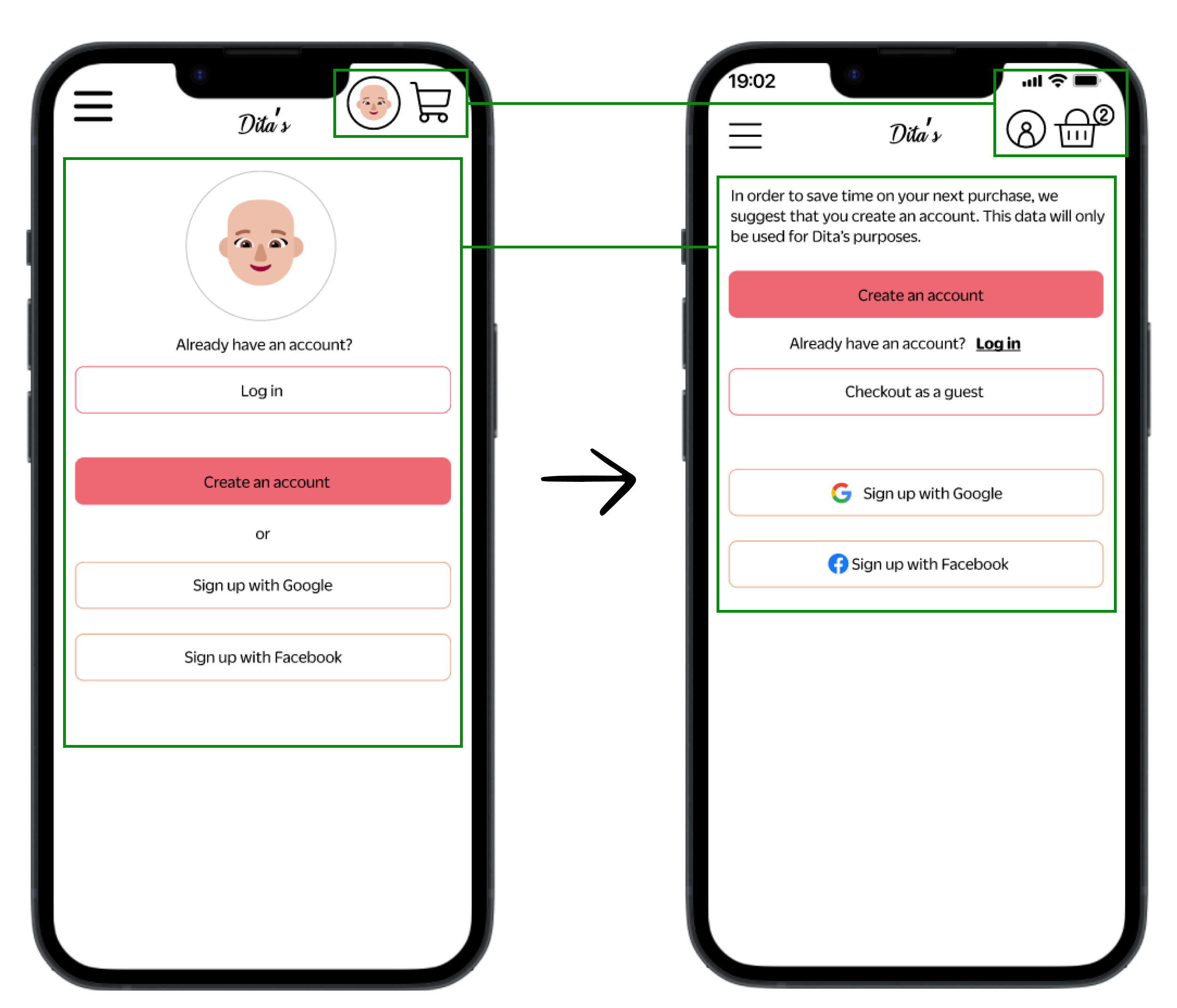
3) Introduction and guest options are missing in the checkout process.
CTAs in home page are confusing.
Missing an introduction text for creating an account page.
Missing the option “checkout as a guest”.
Buttons sometimes are at the very bottom, difficult to find.
Missing consistency of icons and colors. (add to cart and icon # in cart).
Shipping information is not clear at all.
After
I addressed those issues by adding a number to the cart, rephrasing topics, adding more specific information to the product, and completing the delivery information with all possible options.
Before
After
Before
Final change
After
In order to address that issue I added an explanation before creating an account. Also I removed the account avatar because it wasn’t necessary for this site.
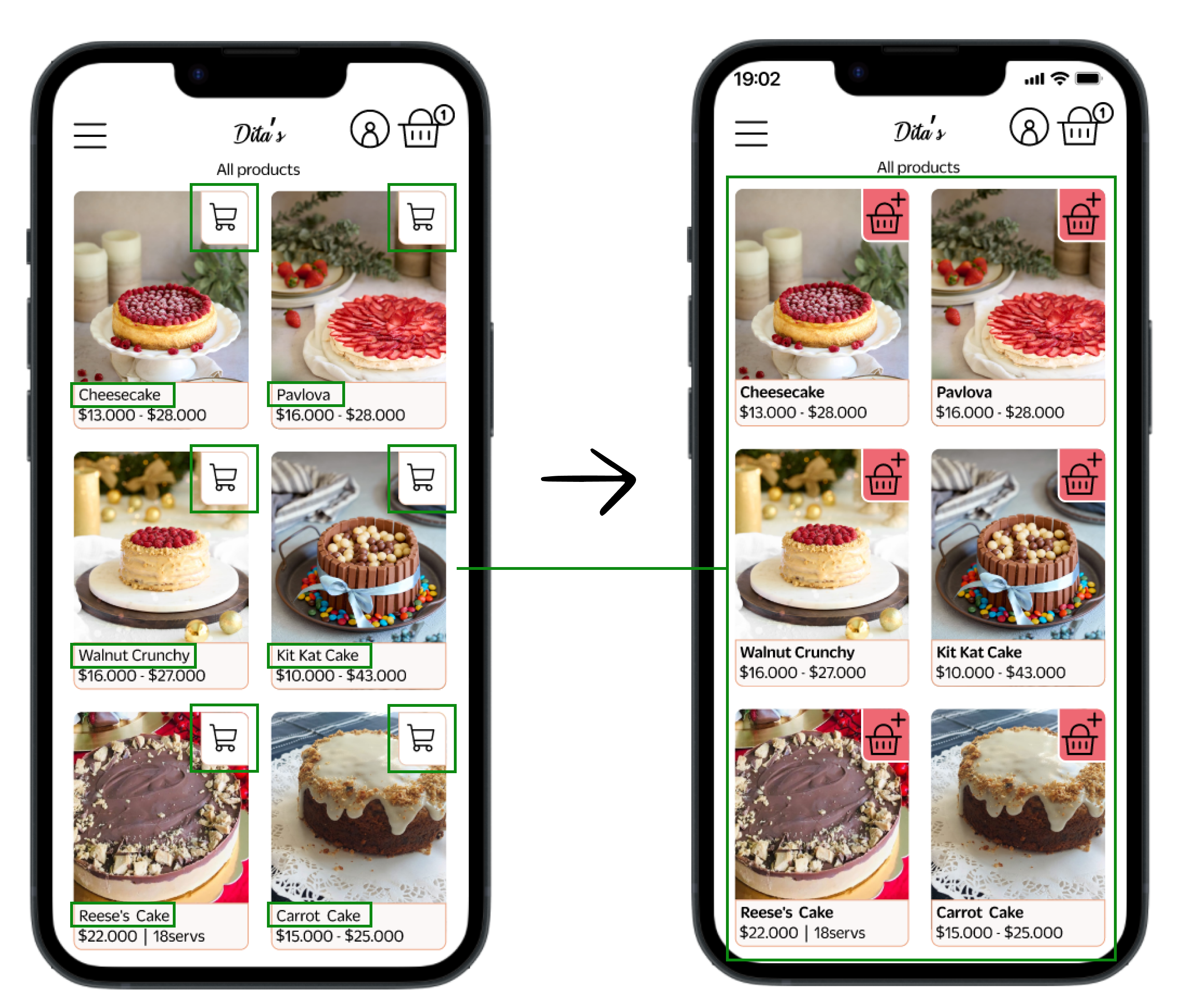
Before
After
I made some final adjustments to improve users' ability to identify essential information. I increased the contrast for cart and product names. Additionally, I replaced the cart icon with the same one used in the top navigation to maintain consistency in design elements.
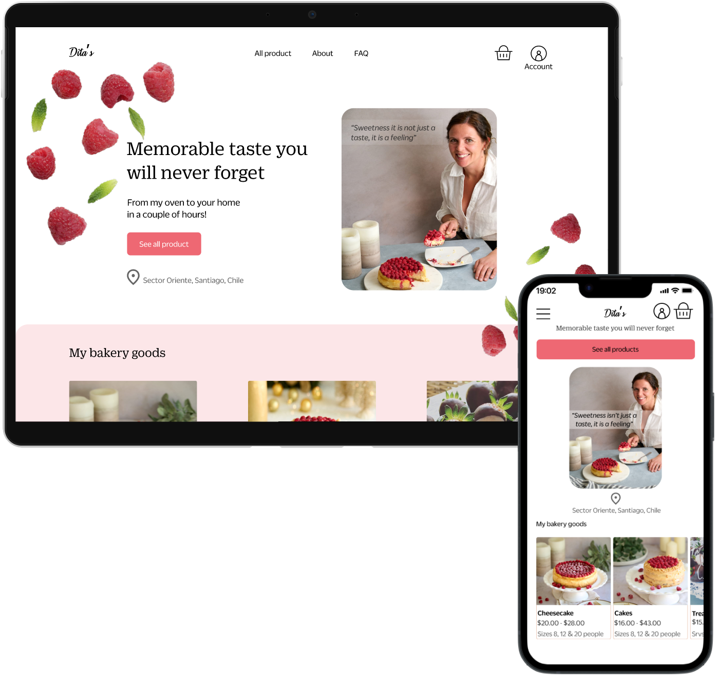
Latest deliverable | Responsive website
View the latest prototype
Conclusion
I faced many challenges while working on this project. Getting feedback from both users and owners can be challenging. It's important to ensure that the owner understands the actual needs of the product beyond their own preferences. Through this process, I've learned to align both perspectives and work towards a common goal.
This website aims to be inclusive. In this project, I learned how to speak with elderly people and how to conduct usability testing in a comfortable way. Conducting usability testing with older people is very different from conducting it with younger people. I learned that they focus on different things, such as contrast and sizing, which helps them follow the flow. Next time, I would like to observe elderly people using their phones in their daily routine to better understand how they use them.
There are many things that can be improved in the project, but due to time constraints, I prioritized what needed to be done. The next step would be to improve the account section by making it easier to use and adding features such as purchase history.


