A service for people traveling with kids that gives them easy access to essential items and toys for their children, no matter where they go. Our goal is to make travel more convenient and eco-friendly.
Families traveling with kids often run out of space and end up buying and throwing away children's items and toys. This costs more money, hurts the environment, and causes stress.
“I've been trying to figure out how to fit all my 16-month-old's essentials into our luggage for a 4-day beach trip. It's been a real challenge.” (A user that was actually planning her luggage for their family vacation)
Activities
User Research | Competitive Analysis | User Interviews | Affinity Mapping | Card Sort | User Personas | User Flows | Task Flows | Sketching | Wireframing | Prototyping | UI design | Usability Testing
Overview
Discover | Problem
My Role
8 weeks | part-time
Duration
Tools
Figma | Maze
Work process
Solo
Research
I began my research with comparative and competitive analysis to see what our competitors offer and how we can differentiate ourselves.
Research | Competitive analysis
I explored companies offering similar services, such as renting or purchasing kids' supplies in various locations. My aim was to discover innovative and convenient ways to help families reduce travel-related stress, especially when flying with children.
Strengths
Simple design
IA very clear
Easy to shop
UI reflects their brand identity
Findings
Weaknesses
Overcrowded IA
Not clear its mission and what they offer
Missing a lot of basics interactions
UI is outdated
No one offers a way to bundle items
I discovered numerous potential ideas that could be implemented to help users find a convenient way to travel lighter with kids. There is an opportunity to integrate these services into Vacasa's existing offerings.
Research | User Interviews
I conducted in person interviews with 5 adults around 30-40 years old, who regularly rent houses for their vacations.
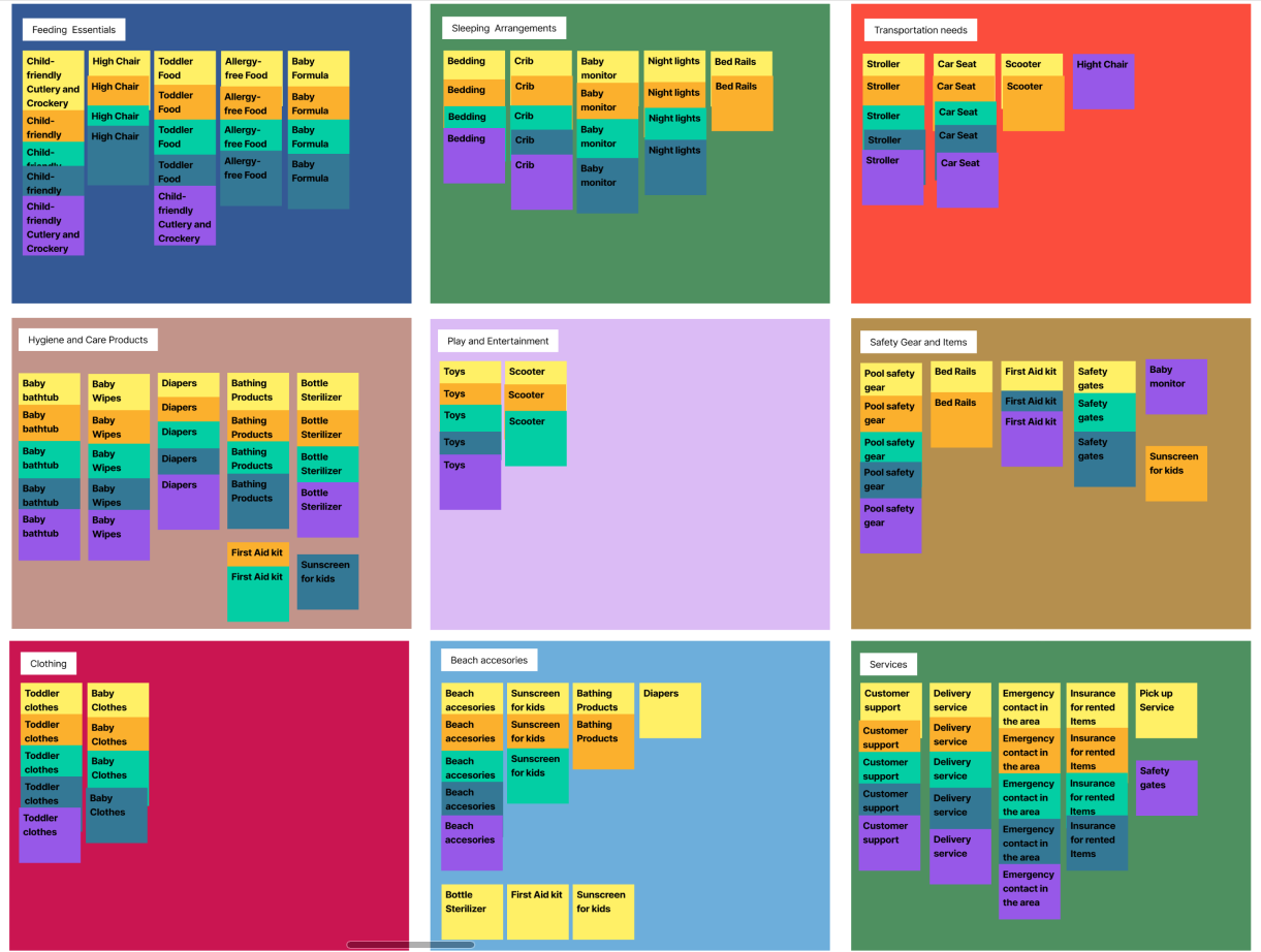
I collected qualitative data that helped me understand how people currently organize their luggage for trips and their concerns during this process. Using affinity mapping I could identify and group better the interview outcomes.
Affinity Mapping
Findings
Overall, parents prioritize their children's needs in travel planning and value services that can help ensure comfort, safety, and entertainment for their children during travel.
Pain points
Struggling with the packing of bulky and heavy items for children.
Difficulty in finding suitable rental bundles catering to toddlers/kids' needs.
Challenges in locating suitable food and essential items at the vacation destination.
Additional time spent sourcing essential items and toys upon arrival at the vacation place.
Define
After gathering all the research about the experience of packing when traveling with kids, I synthesized the data and defined the problem. This helped me develop a point of view (POV) and how might we (HMW) questions
Define | User Persona
To better understand and empathize with my target audience, I created two user personas. One is a mother who often rents a beach house to escape from the winter and needs to carry plenty of beach toys. The other is a parent with two allergy-prone children who often struggles with the weight of baby formula.
Define | Story Board
Define | Card Sort
To further empathize with users, I created a storyboard to understand their pain points and emotions during the packing planning process.
Through an initial card sort activity, I identified categories. They were Feeding Essentials, Security Essentials, Comfort Items, Entertainment & Seasonal Accessories, and Hygiene, providing valuable insight into travelers' packing priorities when traveling with children.
Define | Feature Set
Due to the feature’s scope, I prioritized and generated a list of four categories: must have, nice to have, can come later, and surprising & delightful.
“Traveling with a toddler who has allergies and carrying around heavy items has been quite a challenge for me.”
"Every child is unique, and parents have diverse needs. A personalized service would be a dream come true, catering to our family's specific requirements."
"At times, I find myself missing essential items and end up buying them at my destination, only to leave them behind in the rented house because I can't carry them back. It's a frustrating cycle I'd love to break."
Define | Developing flows
Task Flow
User Flows
For the purpose of adding a new feature to Vacasa, based on the feature set, I chose to develop the task flow for adding a pack from the Kids Comfort Kit.
My research suggests that users prefer renting bundled items instead of separate ones. Therefore, the user flow I've designed involves adding a pack from the Kids' Comfort Kit to a reservation.
I began with a generic concept, refining it over time into a specific user flow, with the aim to eliminate potential confusion when choosing a pack.
Design
To see how the design fits with users’ needs, I sketched some ideas keeping the layout of Vacasa in mind. Then, I made low-fidelity wireframes so that I could change them quickly, try new things, and then move to mid-fi wireframes finalizing in high-fidelity.
Design | Wireframes
Low fidelity
The development of low-fidelity wireframes presented a unique challenge in this case. The need to maintain consistency with Vacasa's existing UI was initially difficult.
Mid fidelity
Then I moved on to mid-fidelity in the actual layout of Vacasa to start giving more shape and see how it looks and works.
High fidelity
Finally, after incorporating feedback and seeking inspiration, I refined my design while maintaining the UI consistency of Vacasa.
Test
To validate the design, five parents around 30-40 were invited to try out the prototype. They gave us great feedback and helped us make the add-on more user-friendly and easy to navigate.
Test | Usability testing
The task was to add a pack from Kids’ comfort Kit and then continue with their reservation.
Findings
I got valuable feedback from the usability testing activity
Simple design
The color palette continues with Vacasa UI line
Easy to find packs from kids comfort kit
Easy to select items in “All inclusive” pack
Final price is clear
Prototype
Labels of packs are not so clear
Hard to add a pack
Icons are confusing
Some interactions are unnecessary and make the flow confusing
Missing an introduction to each pack
Reduce items that will never be selected to be concise
After reviewing the findings of usability testing, I iterate many times according to users pain points.
Prototype iterations
1) Lack of visual element for the Kids’ comfort kit
Before
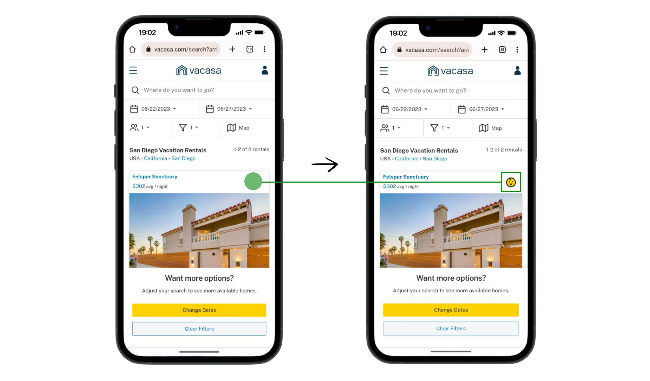
Users were not sure if, after choosing the filter of 'Kids' Comfort Kit,' the results were changed to houses that include that service.
Hover “All-inclusive”
After
To address that, I added a kids' icon to each card to confirm that the results include the 'Kids' Comfort Kit' filter.
2) Confusing IA, interactions and missing CTA
First Iteration
Selected “All-inclusive”
4) Comments in the custom pack are not easy to find
Before
Latest deliverable
I improved the IA by introducing pack details from the start, eliminating hover requirements. I've reorganized information, labels, and icons for clarity. Look for the 'Add Pack' button for easy selection. I've streamlined interactions to two states for a smoother experience and ensured icon consistency, keeping it user-friendly.
3) IA is not simple, overcrowded item list, missing CTA
Latest deliverable
In this iteration, I focused on addressing the same issue as in the second iteration, specifically reducing the number of items shown based on users' preferences, as identified in the usability tests.
After
When users chose the custom pack, they were often looking for a way to add comments to their selected products rather than adding new ones. To address this issue, I added a note icon next to each product to make it easy to find and add comments.
5) Lack of confirmation signal for added pack before booking
Before
After
I added information about the selected service before the checkout screen using both words and icons to maintain consistency throughout the feature.
Latest deliverable
Conclusion
In this project, I navigated various challenges, transforming initial ambiguities into clearer concepts with valuable feedback. The goal was to create an intuitive add-on, the 'Kids Comfort Kit', aimed at making travel with kids a breeze from the booking stage itself.
Looking ahead, observing real-life parental behavior during vacation preparations could provide further insights for enhancement. Time constraints necessitated prioritization, but future improvements could include addressing specific dietary or essential needs like food allergies or specific diaper brands.
In essence, this project embodies progress toward making Vacasa a comprehensive, family-friendly platform. Future iterations will aim for greater inclusivity and convenience, enhancing the overall vacation experience.


